
INFORMATION
When I began my role at Vodafone, I joined a project focused on a significant native application serving six European markets. At the time, we lacked a comprehensive design system tailored to native platforms. The existing design system, developed by the global design team, was well-suited for hybrid applications but did not meet the specific requirements of native platforms.
JOBS DONE
01. Figma design components
02. Creating variables
03. Illustrations and animations
04. Documentation
CHALLENGE
Develop a comprehensive design system for native iOS and Android applications. This system will align with global design guidelines and encompass font styles, spacing measurements, colour palettes, and an extensive icon library. Communicate regularly with the teams to provide clear explanations regarding the design decisions and progress on the project.
MY ROLE
I was responsible for creating the design system and running usability test sessions with customers, overseeing the other designers' contributions, communicating with the development team and giving presentations to the team regarding the progress.

01 COMPONENTS
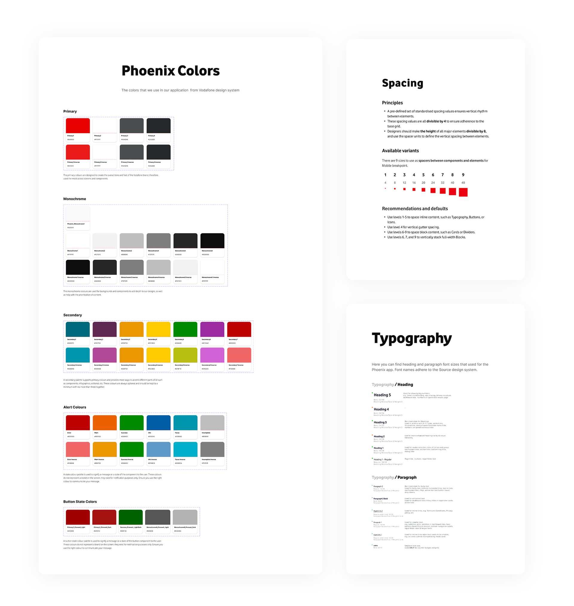
DESIGN TOKENS
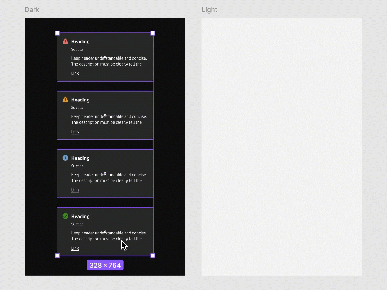
In software design, semantic colours refer to colours with the same names but different values across different themes. For example, in Light mode, the default background colour is white, while in Dark mode, it changes to black. The same variation applies to foreground colours.
To create a new theme, you can duplicate an existing theme, like the Light theme, and then modify the references to suit your preferences.
COMPONENTS
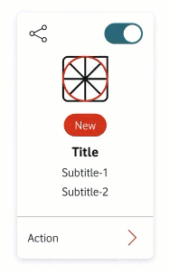
Figma classifies all design elements as components, which are fundamental to our design system. Based on the principles of atomic design, these components serve as the foundational building blocks, allowing the creation of pre-styled, reusable elements. This approach promotes consistency and efficiency throughout the design and development process.
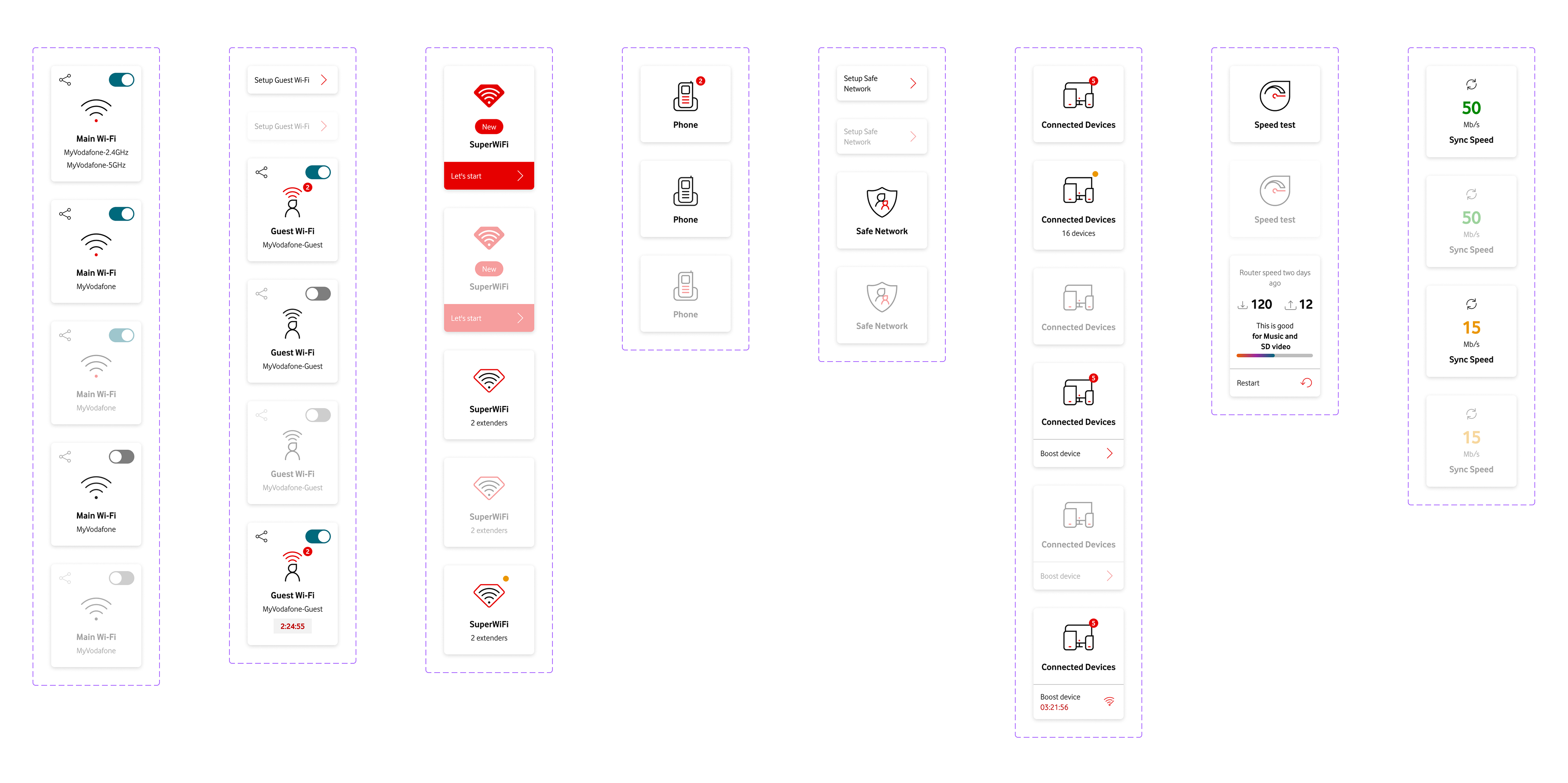
As demonstrated in the animation on the left, the dashboard tile functions as a component, encapsulating various other design elements within it.
PRE-STYLED COMPONENTS
The pre-styled components provided are integral to the design system and are designed for seamless integration into templates, facilitating the rapid creation of pages.
Displayed below on the right are various pre-styled dashboard components, offering designers a broad selection of options to accelerate the development of a homepage.
TEMPLATES
There are two primary templates for page creation. The "Base Template," serving as the initial template, functions as the main screen where replacement components, highlighted in purple, can be easily swapped with other components or pre-styled elements.
This flexibility enables seamless customization and adaptation of the template to suit specific design requirements.
The video below shows how easily we can create and modify pages and create quickly prototypes or flows.

02 VARIABLES
The Figma variables feature effortlessly enables you to modify or generate new themes. This functionality provides a convenient way to customize the visual appearance of your designs and maintain consistency across different elements within your projects.
Our design system comprises a set of variables for colours and numbers, which are used consistently throughout our projects to ensure visual and spacing coherence.

03 ILLUSTRATION and ANIMATIONS
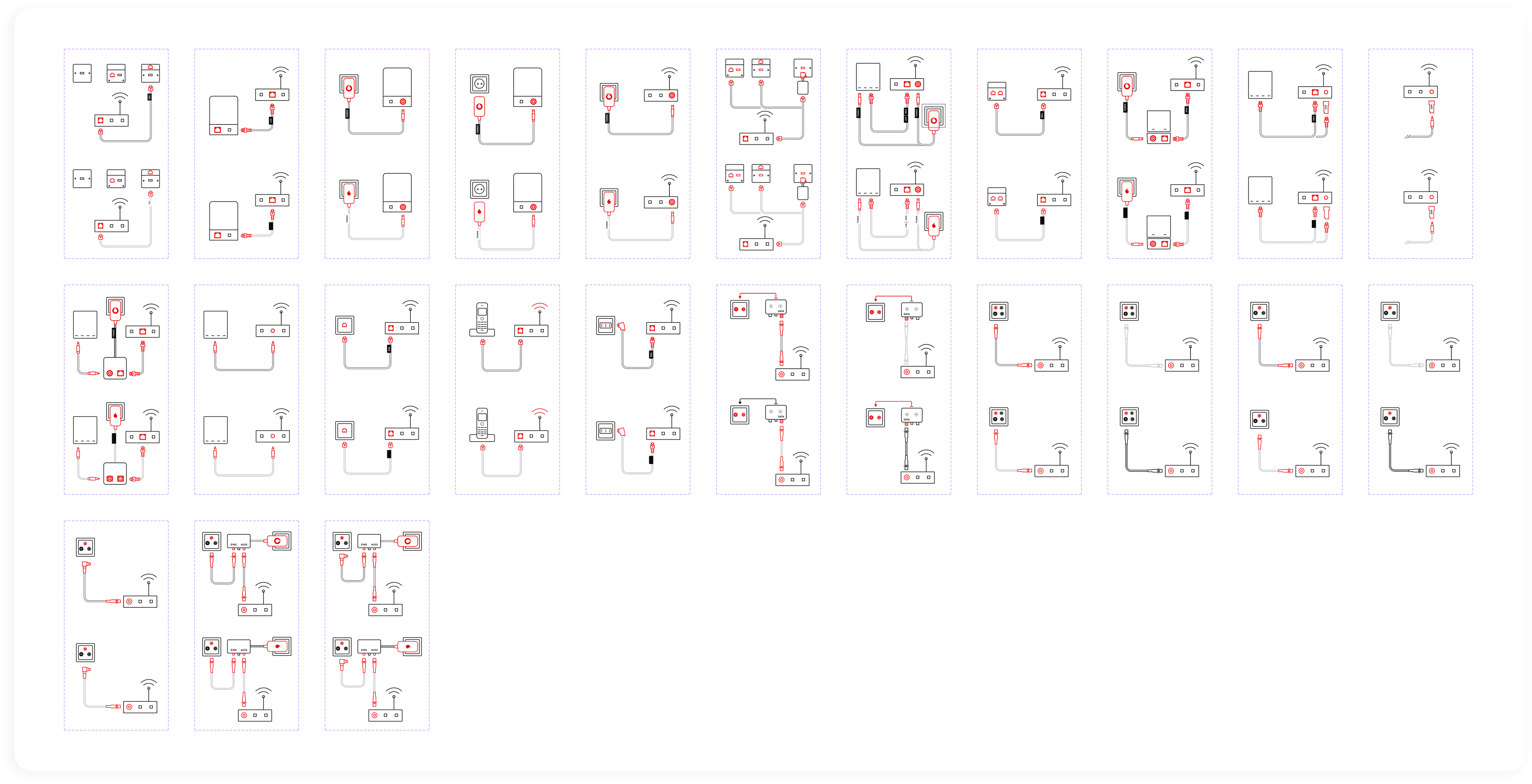
I've crafted around 60 detailed illustrations specifically tailored for the router and cabling onboarding screens. Additionally, I've developed 12 engaging animations (example) to enhance the onboarding tutorial screens.
To maintain a cohesive design language, I've meticulously defined the specifications for all the animations and illustrations.

04 DOCUMENTATION
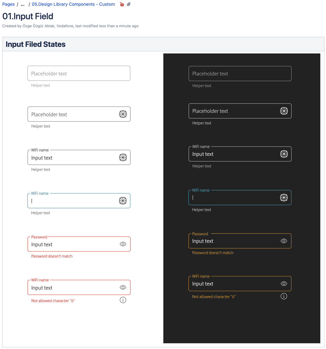
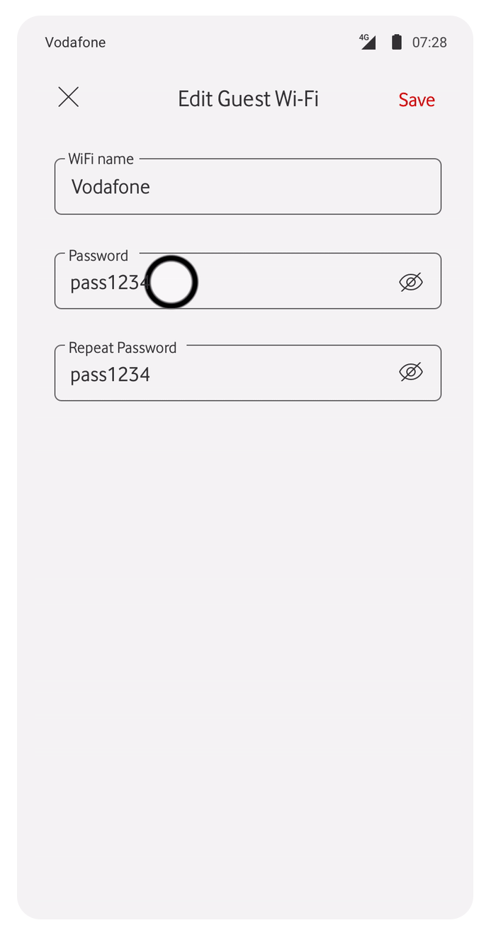
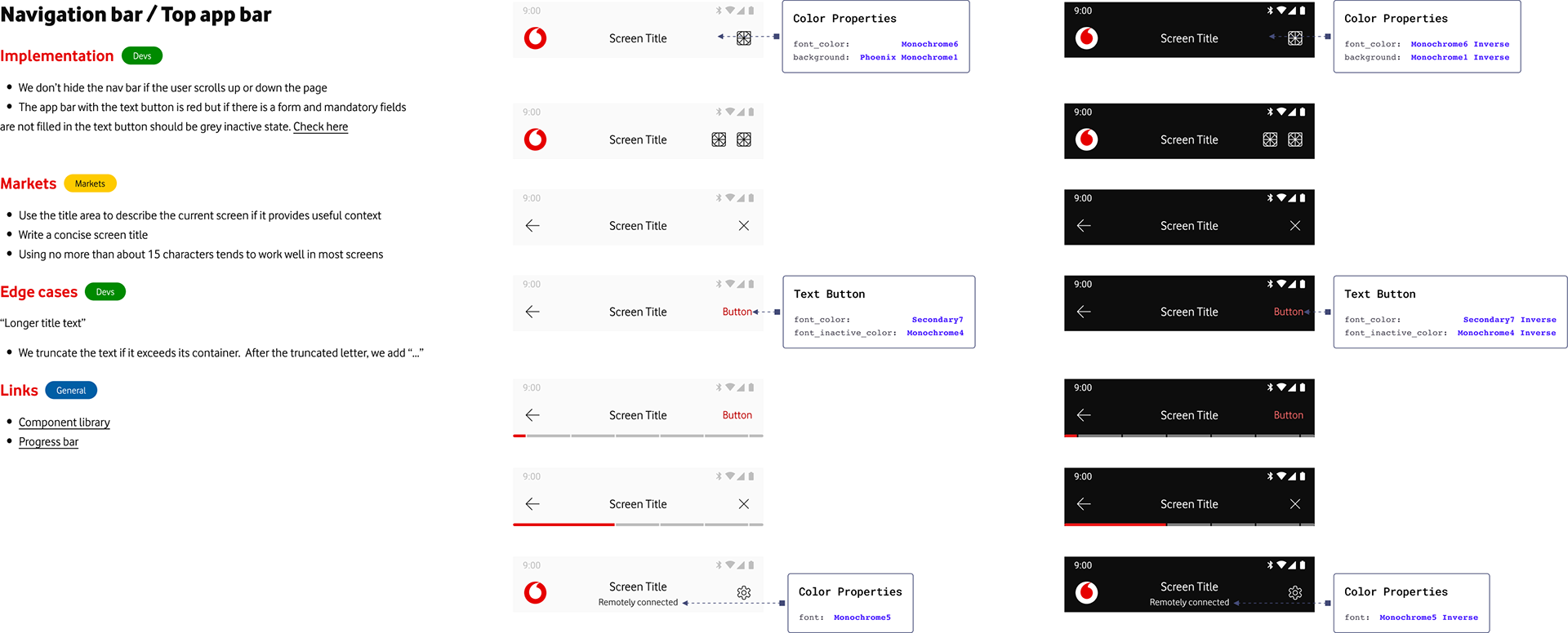
Figma: I used Figma to document and transfer assets to developers. Below, you can see sections for Markets that will implement this component and need to adhere to the defined rules. Edge cases mostly pertain to developers who need to pay attention to details regarding the interaction, behaviour of elements, or text rules. The implementation section is directly related to the Dev team, which explains major details that we have discussed in our handover meetings.
Confluence: All the documentation created in Figma is duplicated in Confluence to ensure that it is archived and accessible to a larger audience. Confluence provides additional detailed information, such as animations, which help to precisely describe the interaction and behaviour of components, specifically for developers. As seen below on the right-hand-side.