I love fancy walkthrough tutorials. When you open it the first time, the lovely animations help you understand the features. However, I don't read them; I won't skip the next one unless the animation is outstanding 😎 What about you? Have you ever read entire sequences of walkthroughs?
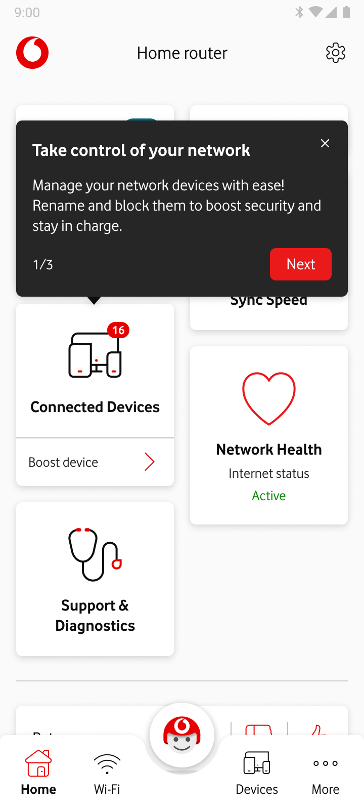
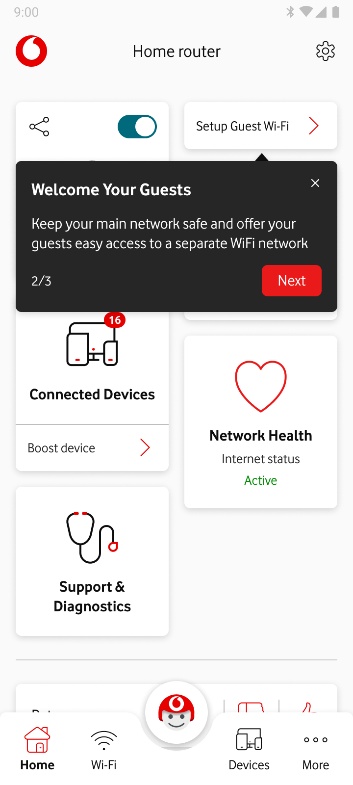
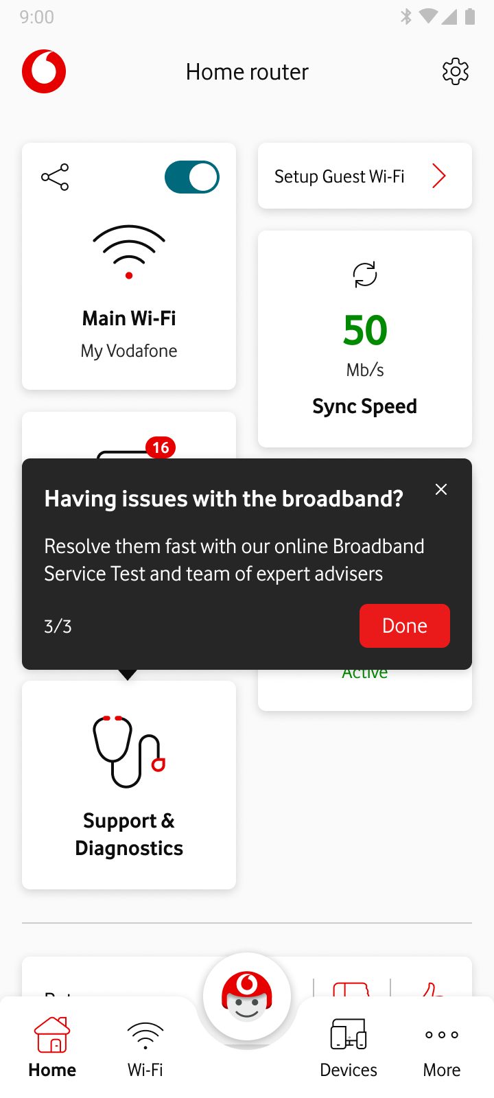
Vodafone router management app's dashboard tiles were designed to be self-explanatory and intuitive (spoiler: we were thinking that way 😉). To ensure our users could easily navigate our platform, we provided walkthrough cards in advance to help them better understand our main feature sets.
AND
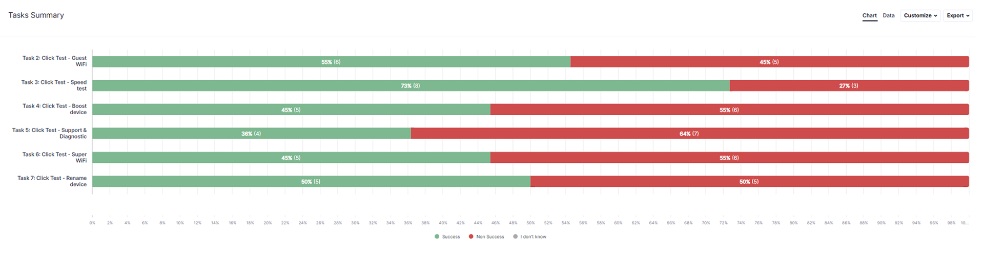
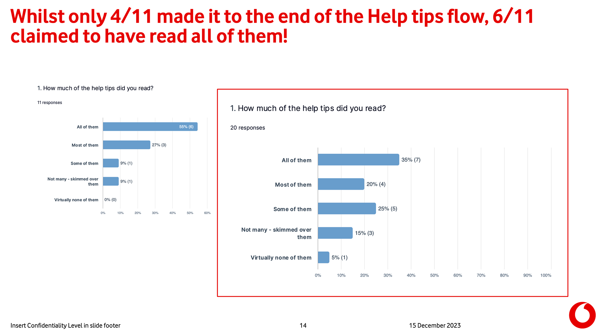
The analytics showed us that 80% of the users tapped the skip button in no time, only 20% continued to the second tutorial card, and then there was a 100% drop rate. 👎
Let's scratch the surface a bit...⛏️
I had two questions: "Do we need walkthroughs?" and "Do users understand the tile based on its short title?"
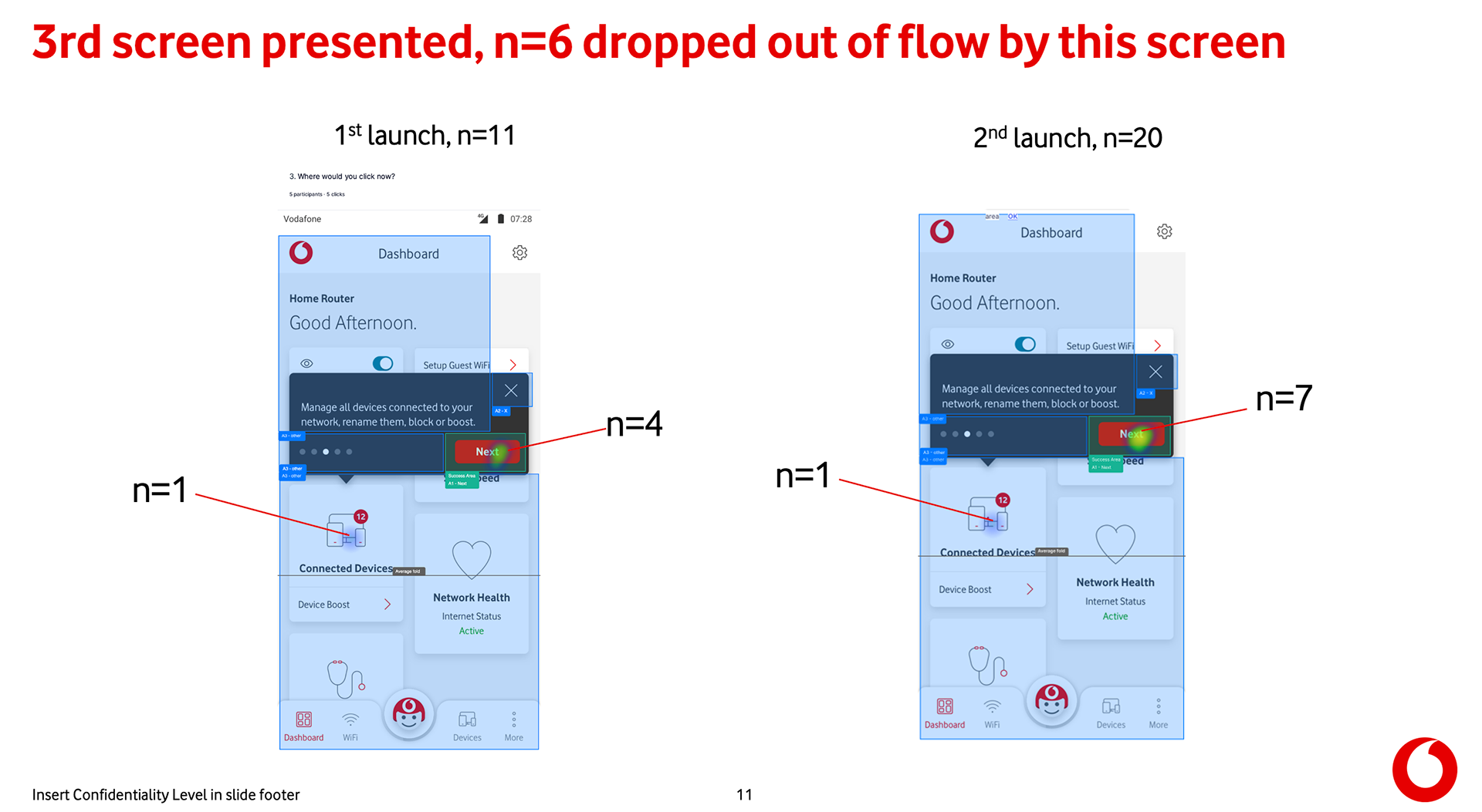
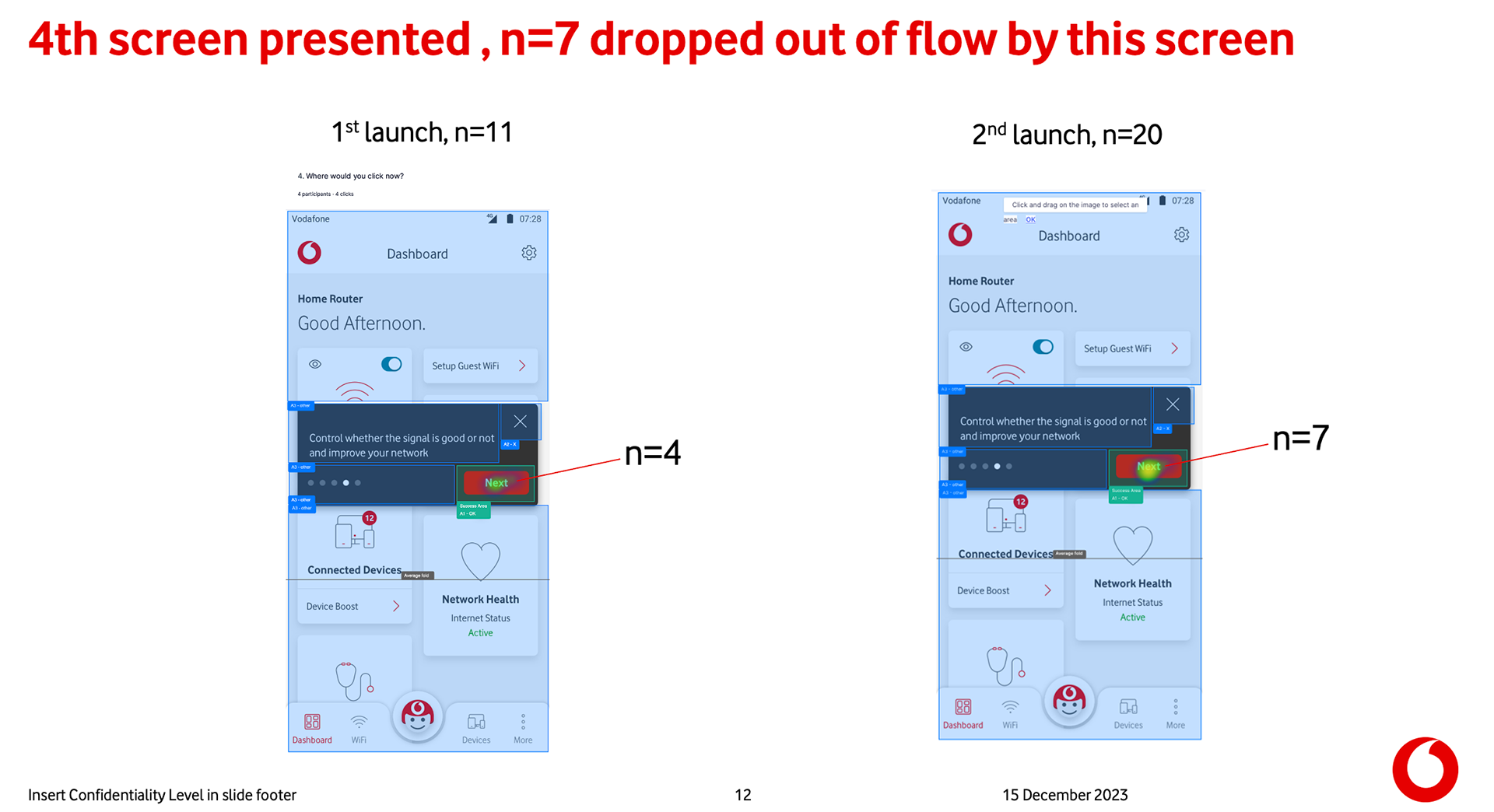
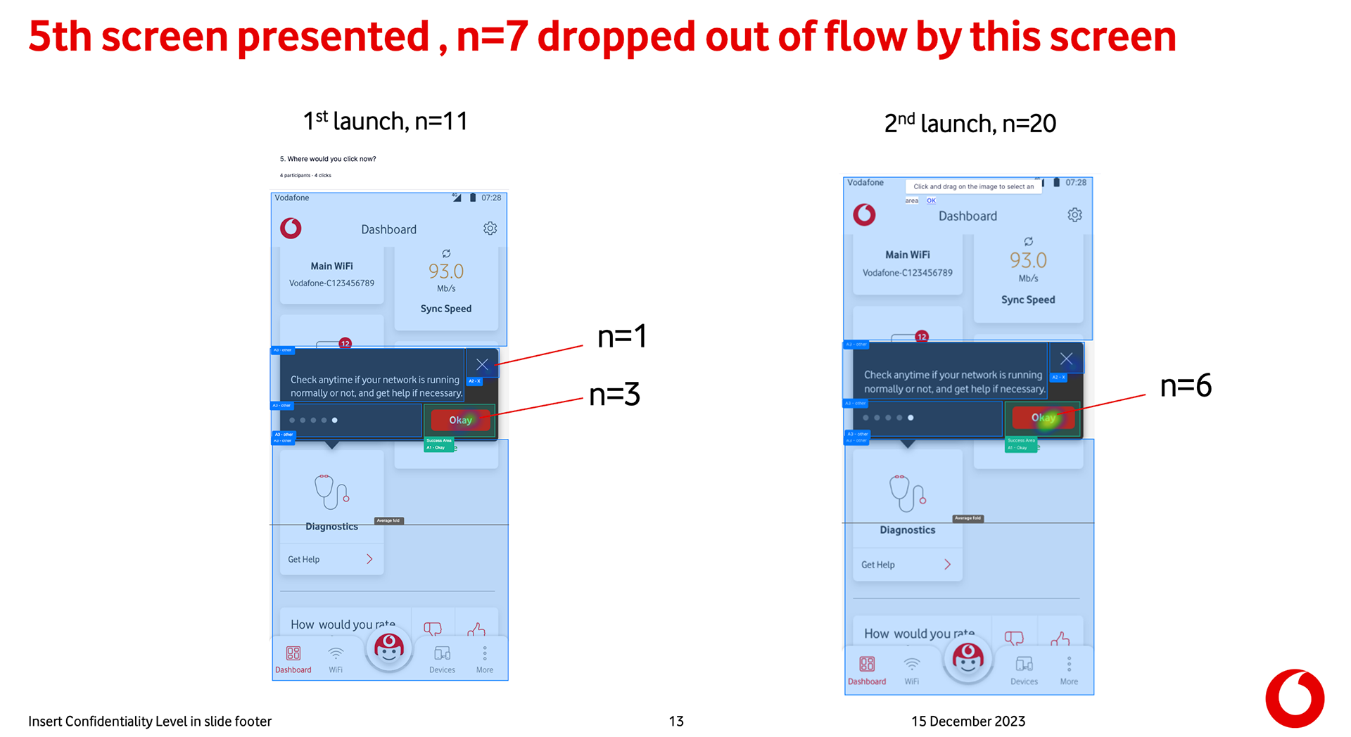
There was only one way to bring this question to light: ask customers if they knew what each card was about.

User research - Dashboard tiles
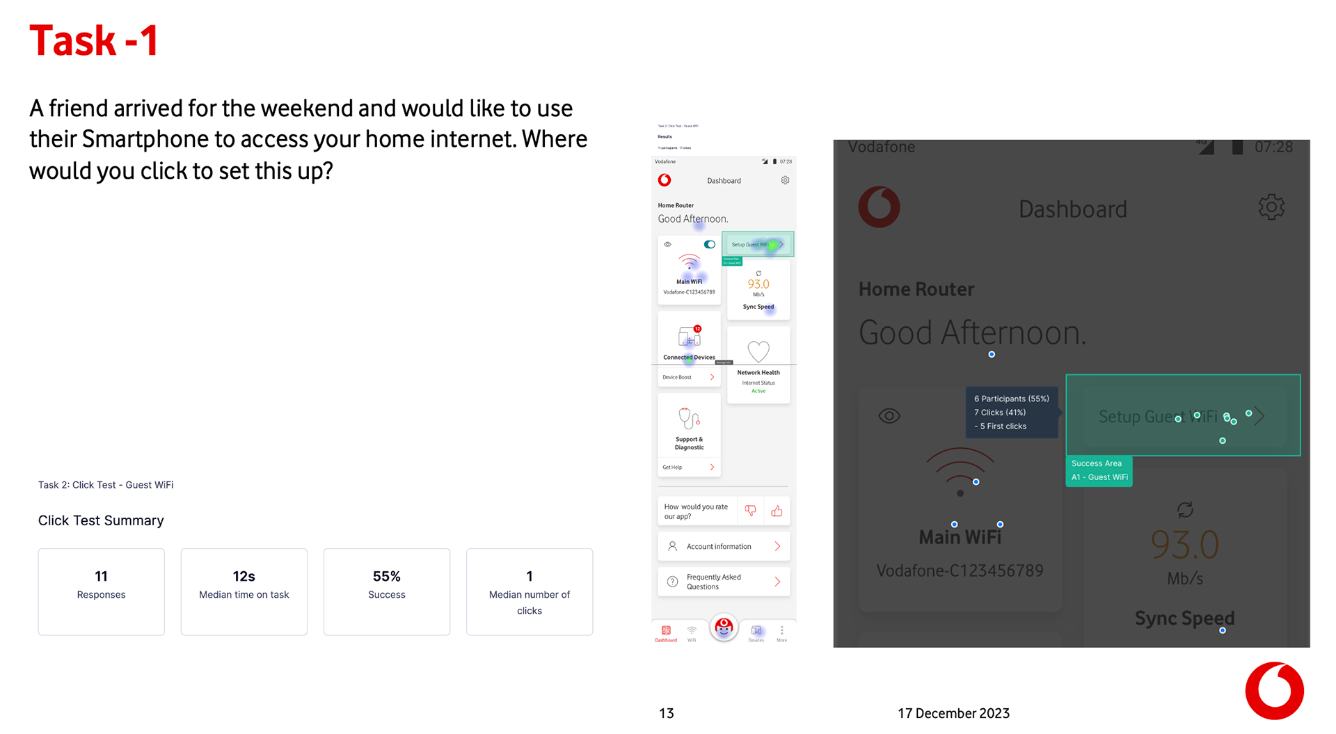
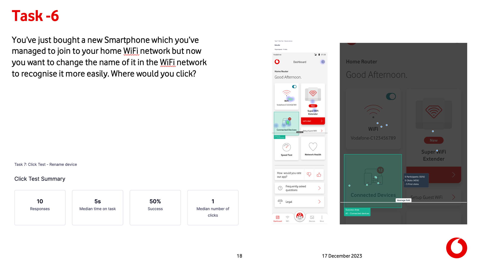
It was obvious that only we knew what the dashboard tiles were 🤩 It's like we designed them for ourselves, or this was an excellent example of corporate blindness. 😵💫

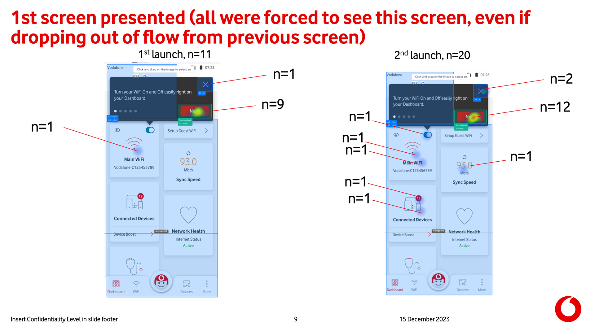
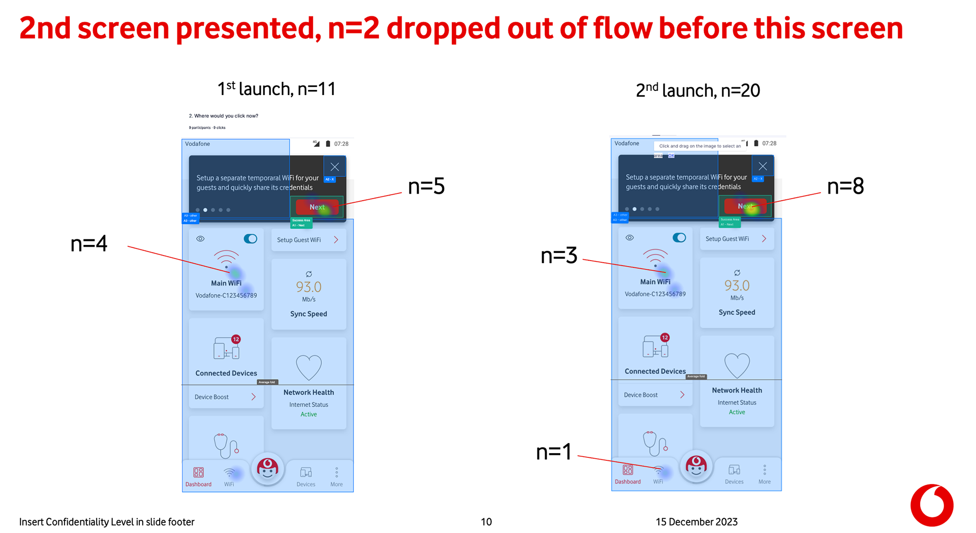
In the second research, we triggered the tooltips when the user was on the dashboard. At the end of the education, we assigned them to "Please find the iPhone device that connected to your network and pause it for an hour." 75% of participants tapped the right tile, "connected devices", so I validated that tooltips were working.
User research - Walkthrough tooltips

Our extensive research has determined that limiting the number of tooltips to three is the most effective approach. Tooltips provide a superior user experience compared to walkthrough animations. Therefore, I highly recommend implementing this strategy to enhance your product's usability and success.

Final walkthroughs