At Metro, we had continuous user interviews and usability sessions since we started the mobile app. The participants were required to complete a User Experience Questionnaire survey, followed by a five-minute discussion about the product or feature at the end of the session.
"The User Experience Questionnaire(UEQ) provides information from each scale, along with defined scores for different aspects of the product."
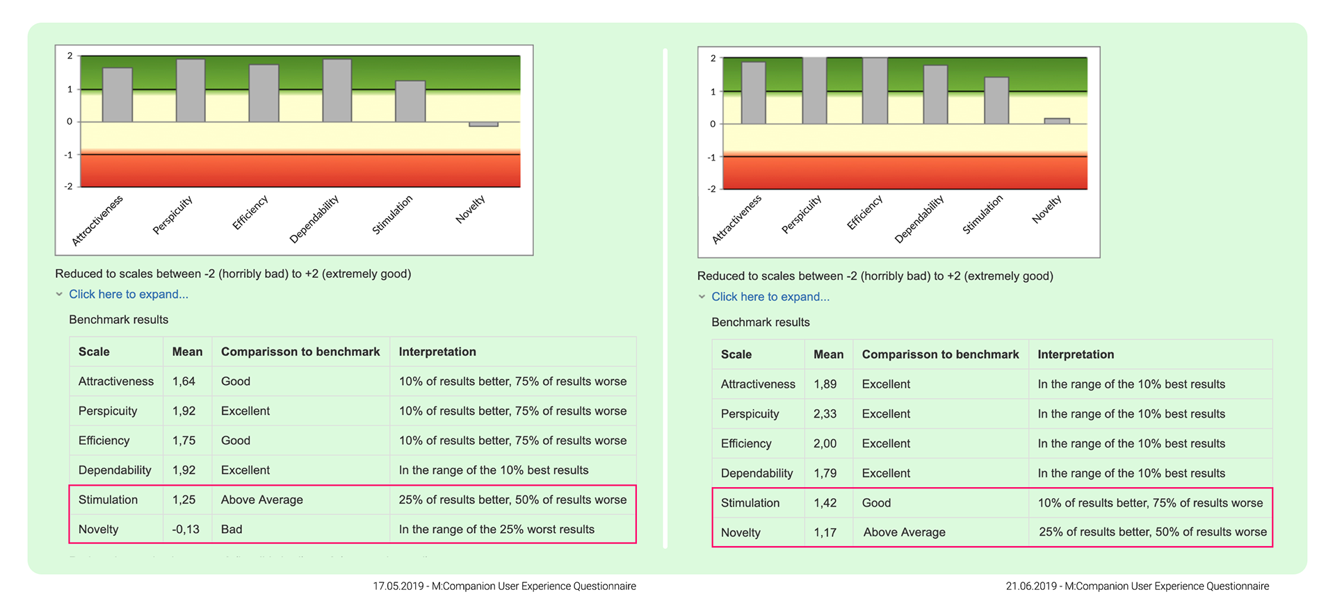
After gathering the participants' feedback, I discovered that the METRO app is perceived as a classic, monotonic enterprise application UI. I was convinced when I matched the verbal input to the User Experience Questionnaire survey results. The app's hedonic quality (exciting or boring) needed to be improved.
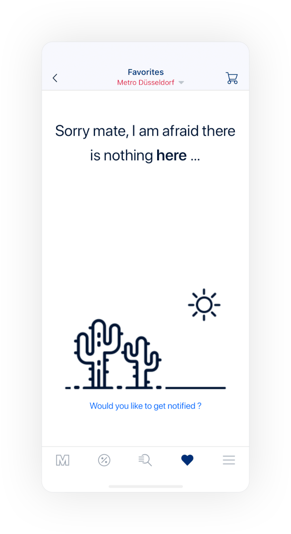
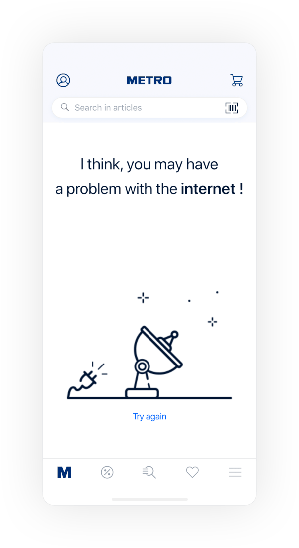
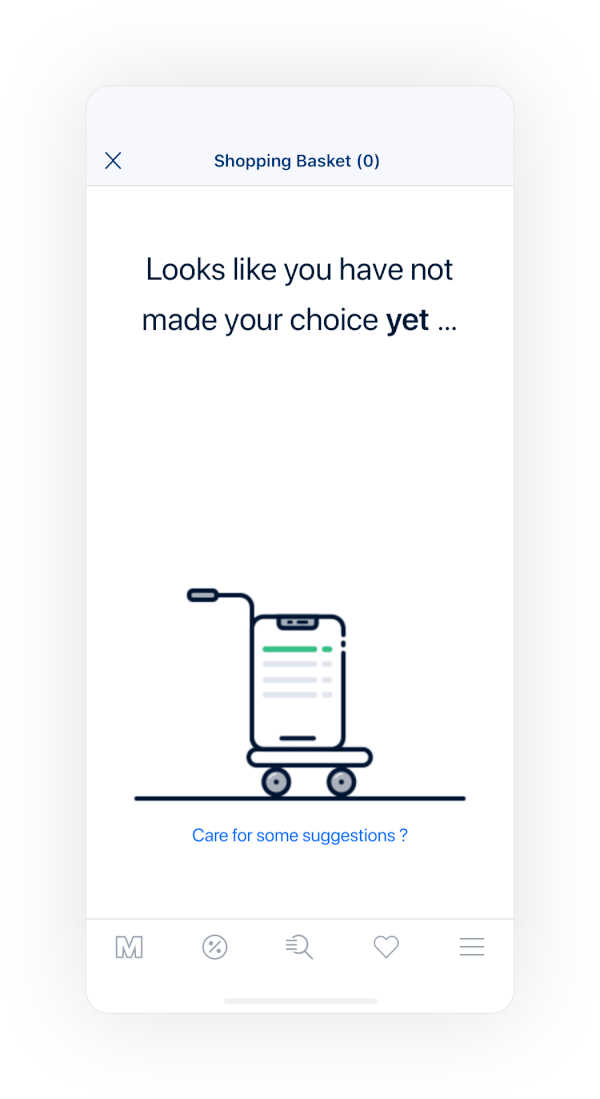
I identified situations where I could add humour to the application without affecting its functionality. Mainly, there were two moments when I could put a smile on the user's face.
The first one used Lottie preloader animations when the page loading took over 3 seconds. Then, I decided to use a similar animation approach for empty states, such as no search results, promotions, etc.
We tested new animations with two cohorts consisting of 14 Metro customers. The results were promising, as shown in the figure below. After obtaining sufficient positive results, I incorporated animations into the Metro application.
Throughout two and a half years of my work at Metro GmbH, adding humour to our application was the most appreciated improvement by the customers 🥳.