The goal of the task was to improve the device list page because we gathered negative feedback from our customers who wanted to find their newly added device/s in their network.
After the initial interview with one customer who had that problem, it turned out that some of the wireless devices' fingerprints either were empty or did not match the device type, i.e., "Unknown-a2:a5:96:7e:c8:7f"
The progress consisted of four steps as shown below, but I want to discuss social media research.
1. Define the problem
2. Brainstorming sessions with the team
3. Analysing the API
4. Surveying to clarify the information prioritisation based on users -> LinkedIn groups
2. Brainstorming sessions with the team
3. Analysing the API
4. Surveying to clarify the information prioritisation based on users -> LinkedIn groups
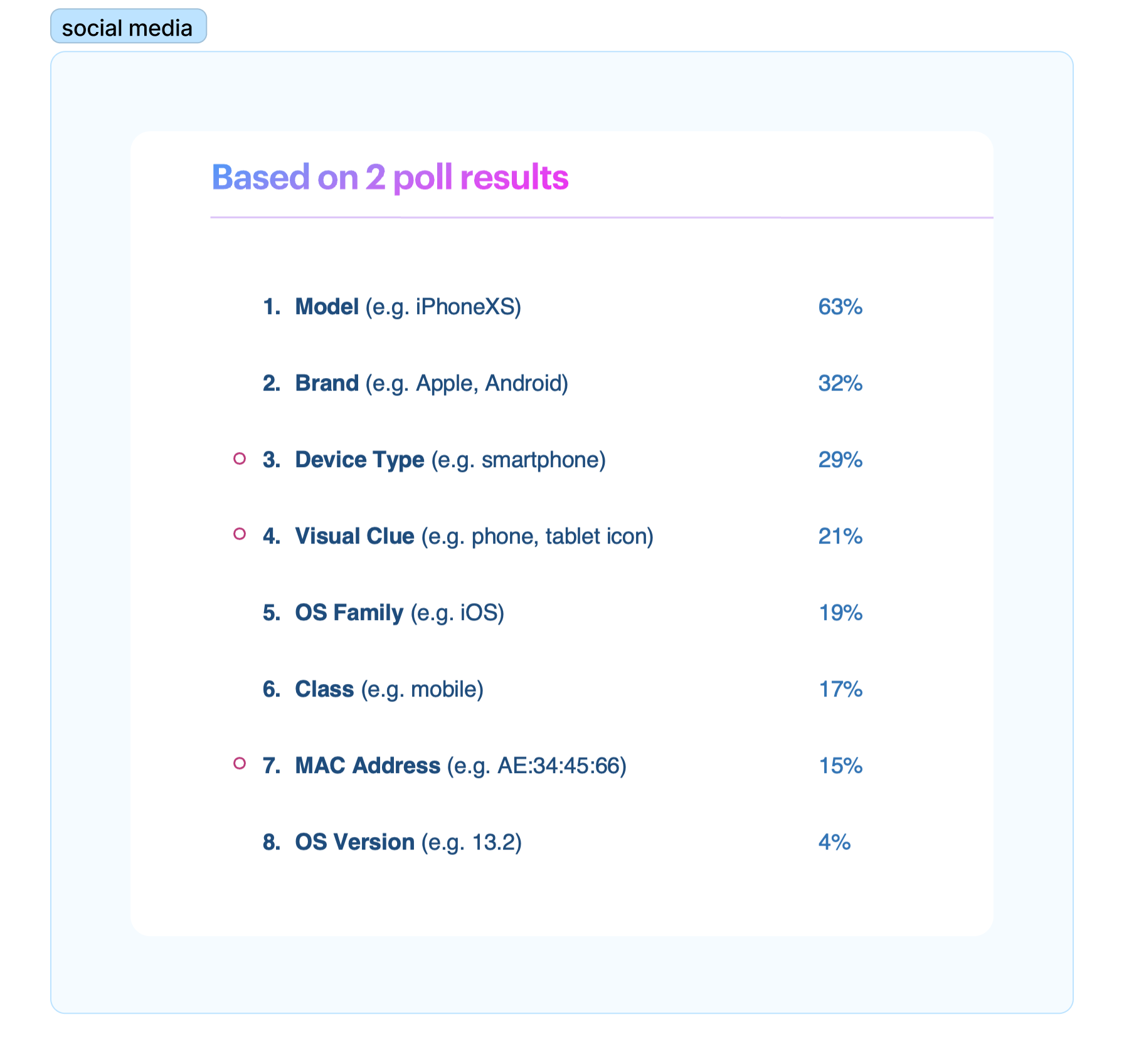
Almost all of us use a router to connect to the internet and add some devices to our network. How many of us tried to find a newly added device in his/her network manager? Not many except the power users. That's why running a survey in Liknedin made sense at that point, as there are a lot of target users.
To begin with, I analyzed the API and found that it returned eight attributes of device information. As a user, what would be the most beneficial information that helps you easily distinguish a device with an unknown name? Let's see what LinkedIn members choose. I split up the answers and posted two groups on Linkedin (as you may know, LinkedIn does not allow adding more than four options for polls)

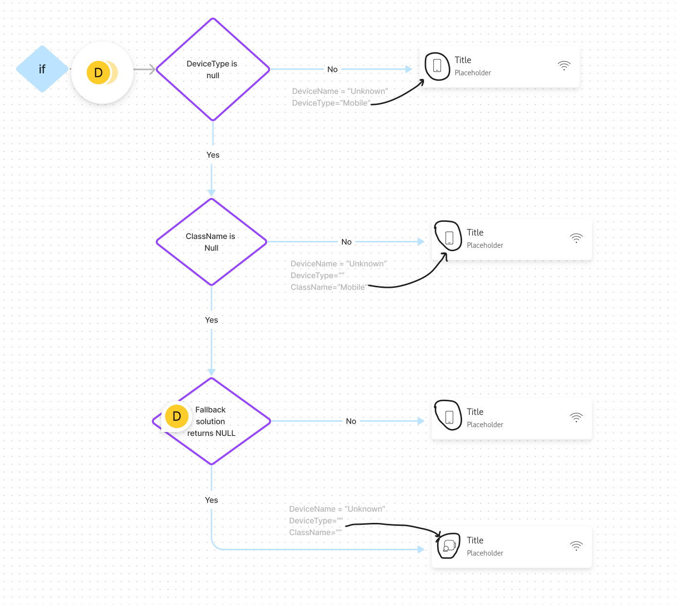
a screenshot of a small piece of logic flow
Social media helped me to get a quick overview of prioritisation.
Now, let's jump on the most crucial step: creating the logic flow together with devs because it is evident that we could not show all eight pieces of information per device in the list; otherwise, we would cause information overload.
As I recall, we had at least two meetings where we put our heads together to discuss the flow. We also had many insightful conversations on FigJam. Our collaboration and hard work led us to a reasonable flow.
Let's move forward to the exciting stage of visual design. However, we encountered a minor bump in the road as we currently don't have any credit available for testing 😩 I didn't let this setback discourage us. Instead, let's find creative ways to overcome this challenge and move closer towards our goal.
Guerilla testing 😎 🚀
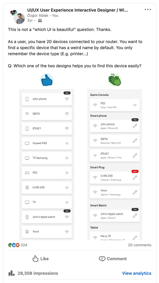
We have suffered enough from the question, "Which UI is beautiful?" right? Therefore, I contextualised the question and posted it to two groups on LinkedIn.
Left: current solution.
Right: new suggestion.
Right: new suggestion.
The new design received the most appreciation. In addition to voting, I received beneficial feedback and implemented it in my design.
After thoroughly presenting the entire process to the team, we confidently decided to move forward with the new version without delay in testing it with our clients.
Our device listing section has received positive feedback from the market for six months, with no negative comments.🤞🎉